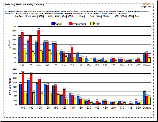
The bar chart results show at a glance how the designated grouping performed. First, a chart of performance based on the retail price of the items is presented. Next, performance based on the investment or cost of goods sold is presented. It might be useful to change categories or vendors or work with different sort orders to present that data in a variety of ways.
In these two bar charts, the first is ordered by categories or vendors with the highest retail sales. The second is ordered by categories or vendors with the highest dollar investment.
Detail area is presented as follows:
|
A
|
These are column headers to be used in the table portion of the report. See the description below.
|
|
B
|
This is the dollar amount.
|
|
C
|
These are performance by category or vendor. For each category, there are three bars:
•Blue is retail sales.
•Red is average dollars invested in the inventory for this category.
•Yellow is the amount of profit generated.
|